Dear reader: This page is part of a series of articles written for vision professionals. If that’s not you, it might not make much sense. If you’d like to learn all about eyes, vision impairment and what you can do about it, I strongly recommend you start by reading the article series I wrote for everyone, which starts here (click).
This site is in the process of being updated, with extra content designed for the layperson as well as vision professionals. I’m afraid the formatting of existing pages has been affected — sorry about that. It’s still readable, but hopefully it will all be fixed up soon, better than before.
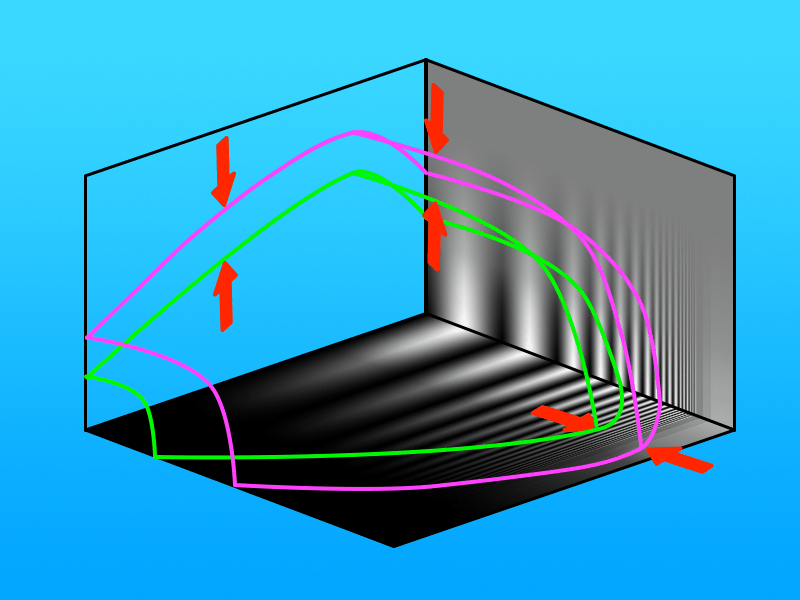
The Optimal Visual Volume, in which vision is comfortable, is smaller than the patient’s full Visual Volume.
Reserves Are Crucial for Comfort and Efficiency
In my previous discussion of the Visual Volume I’ve alluded frequently to the difference between being able to read print barely (where the point is only just within the boundary between Seen and Not-Seen space) and reading easily. All of that relies on the concept of Reserve.
Reserve makes perfect sense. Whatever is at threshold will always be difficult to see, just by definition. The core question is, how much reserve is enough?
Consider again how people with healthy eyes see. Even if they have quite blurred vision, going three steps higher on a VA chart (that is, moving to a print twice as large) should always result in quite comfortable and accurate vision.


That’s all referring to Acuity Reserve, but other factors also require a reserve. For instance, on the Contrast Sensitivity Function we can see there should also be a Contrast Reserve .

So any print with a size and contrast that falls within the purple boundary can be seen, but only print that falls within the green boundary will be seen easily. If we look at the BSF, there will be a Luminance Reserve as well.
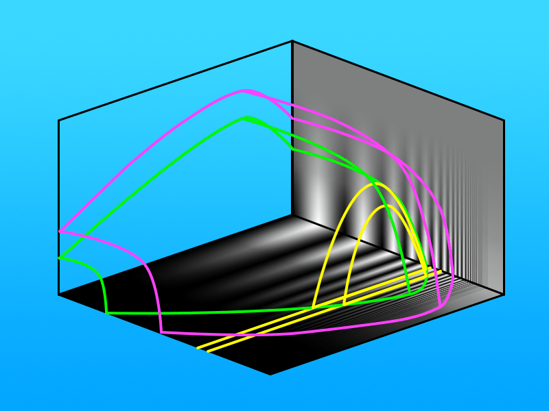
Reserves Guide Task Design
This is critical in terms of what print is selected by people designing newspapers, magazines, books, street signs, movie captions, etc. If they are doing their job properly, (and sometimes they don’t), then they will never choose print that is below a certain size, or below a certain contrast. At the same time though, they don’t want to use print that is too large, otherwise they can’t fit enough words on a page, so there is an upper limit for size as well. Really, it’s quite a small range, indicated on this CSF as the area between the two yellow lines. Of course, short sections of print can be larger, such as newspaper headlines.

Aside: Sure, even though it would be technically possible to produce an entire newspaper with headline-sized print, it’s not a practical proposition. It’s something quite a few of my patients have suggested though!
Looking outside of this fairly small range, we can see the reasons why print outside that range isn’t chosen, or at least not if the writer actually wants people to read it — legal fine print is a good example of print that is difficult by design. Occasionally very small print is used for reasons of space, such as the stock market page and racing page in our local newspaper, and these are examples of situations where even people with normal vision might be reaching for a magnifying glass.

Reserves Define the Optimal Visual Volume
Let’s apply those reserves to our normal Visual Volume:
Stepping in by a standard amount from the boundary of the VV creates a smaller volume of the same shape, inside the VV. I’m calling this the Optimal Visual Volume (OVV).
Now, let’s map that standard range of print sizes on to the OVV:
Points to note:
- Text within those print sizes falls well within the normal OVV over a fairly wide range of illumination, roughly from a normally-lit living room at the low end to near a sunny window on the other end.
- We can still read such print in dimmer rooms, but we’ll be tending to looking for a bit of extra light if we’re reading for long.
- At the very brightest end of the scale (direct sunlight) we can still read the print but we’ll be experiencing discomfort glare, so we’ll be putting on sunnies or bringing the print into the shade.